I wanted to make a version of my previous post but focusing exclusively on the US. So, here’s the state of energy in the United States in 5 figures. All charts are made by me unless otherwise cited, and data sources are cited.
Primary energy consumption by source and sector
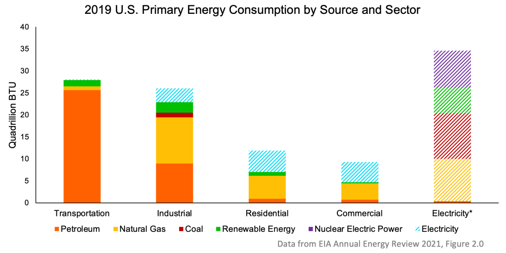
Primary energy is the energy content used during energy production, not the energy that makes it to the end use[1]. For example, about two-thirds of electrical energy is lost in transmission or conversion between the power plant and the home outlet. Primary energy consumption for coal would not subtract that portion lost.
This is why the electricity primary consumption via production bar (far right) is so much bigger than the sum of the blue electricity consumption bars on top of the sector columns. The reason I have these blue bars, rather than just including “electricity from coal” in the “coal” sub-bars is that I don’t actually have data for the electricity sourcing of each sector. The best I can do is show what goes into the opaque mixing pot of electricity production and how much electricity goes out of the pot into each sector.
You could infer something from the figure with a few reasonable assumptions. That is, the large electrical losses make electrifying transport and industry hard, which contributes to how small the blue bars are. A process that is driven by, say, coal furnaces, is probably not economical to electrify if that electricity is coming from a coal-powered plant.
Takeaways:
- Transportation is overwhelmingly petroleum, as you’d expect.
- We have large dependence on natural gas across the industrial, residential, and commercial sectors.
- Electrification has a long way to go. The hungrier the sector, the less electricity it eats—not just by percentage, but total quantity.
- Electricity is more diverse, but still over 50% coal and natural gas, with nuclear, then finally renewables following.
Primary energy and electricity by source
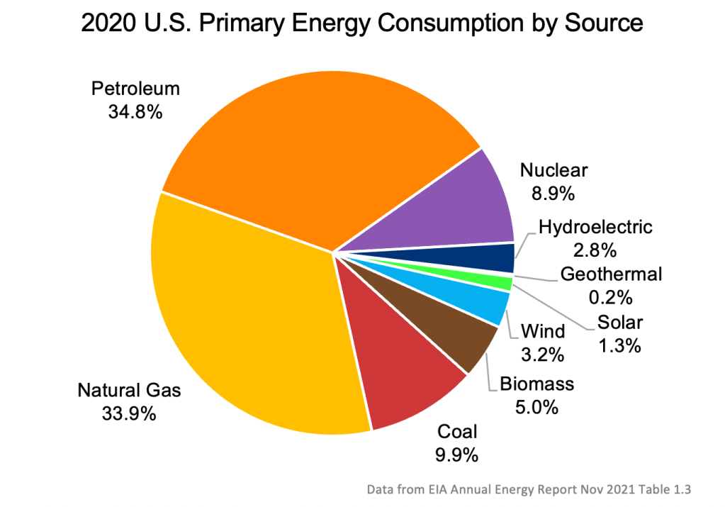
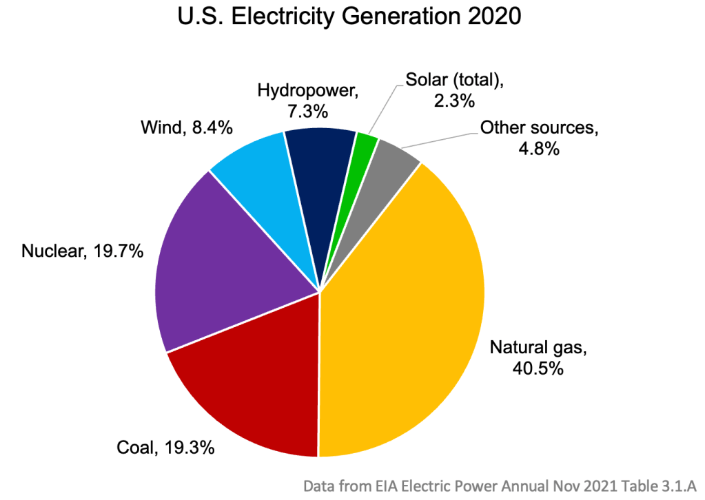
These plots further break down the renewable portions of primary energy consumption and electricity net generation. Here, we see that:
- Nuclear remains the largest alternative energy source in use by several times
- Wind leads renewables at ~3%, with hydroelectric close behind and solar at ~1%
- We are highly dependent on natural gas: it is nearly beating out petroleum for primary energy consumption and dominates electricity generation
Fossil Fuel Consumption versus Imports
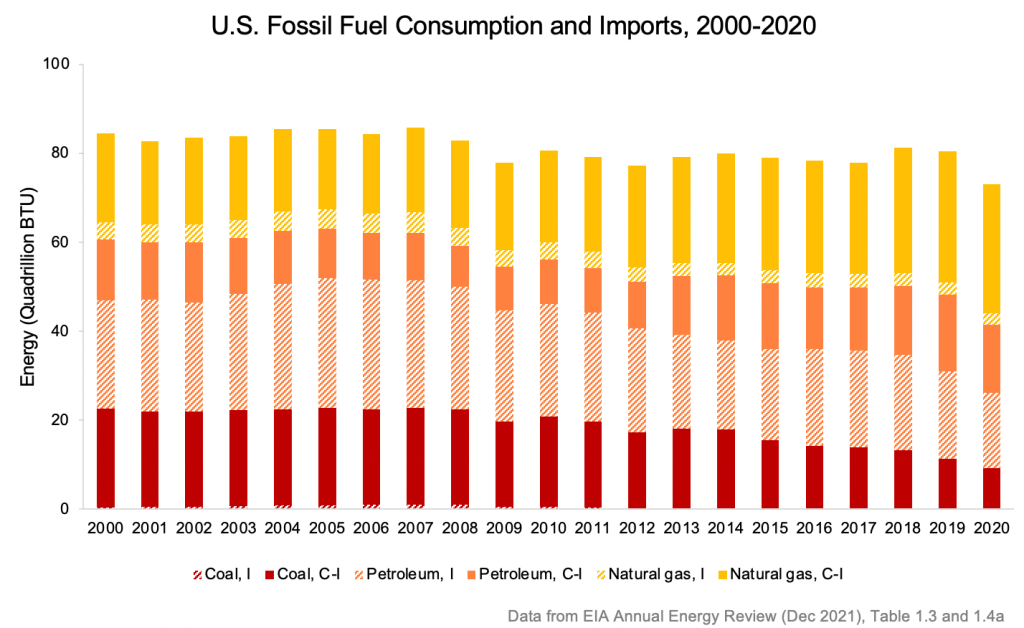
If you’re curious about U.S. energy independence, here’s a plot for you. We import negligible amounts of electricity, so fossil fuels, specifically petroleum, is where the dependence is. In 2020 we’ve seen fuel exports exceed fuel imports—a historic event. However, here I’ve plotted gross imports (rather than net imports) because I think it gives a better sense of dependence. Two units exported and one unit imported isn’t the same as one unit exported: if it were, there’d be no reason not to skip the hassle and simply export one unit. The imports are imported for a reason, whether that be the type of petroleum or economics of transport, as explained in this nice EIA page[2]. Here I lay the imports (striped segment) on top of the overall consumption (total length of a color) so you can get a feel for their scale.
Takeaways:
- The only fossil fuel we import a significant share of is petroleum
- Petroleum imports have been slowly falling in absolute quantity and percentage, but still measure to over half of our total petroleum consumption
70-year trends in energy consumption
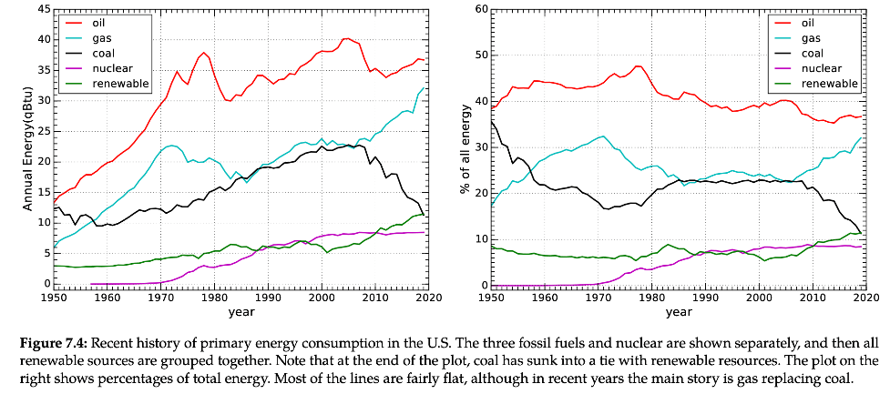
Takeaways:
- Oil consumption is still growing
- Natural gas consumption is still growing
- Only coal has gone down
- Renewable energy is growing, but it hasn’t shot up particularly dramatically (as some other plots with less context would have you believe)
- Nuclear has plateaued
Imagining a 100% renewable future
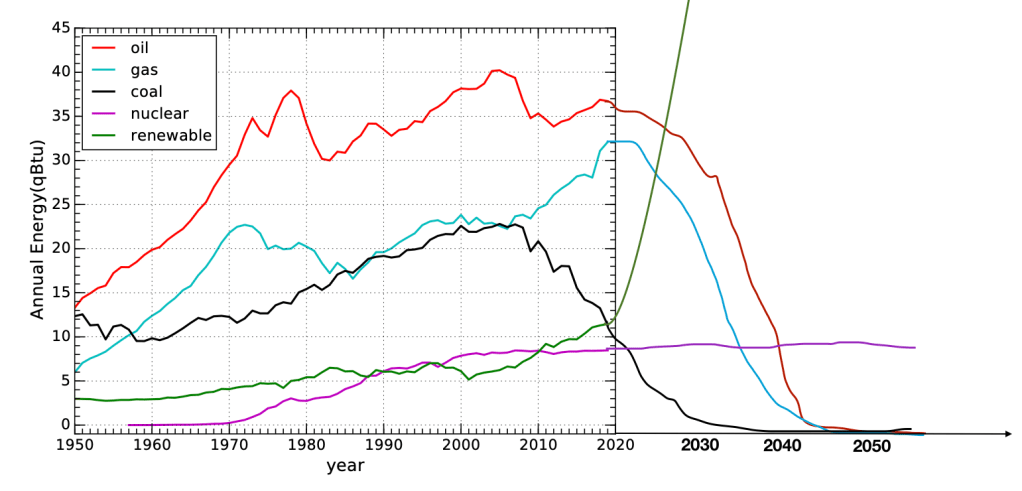
This is a sketch of what if might look like to phase out fossil fuels by ~2045. This is somewhat informed by “net zero” targets, where some governments/corporations have set them as early as 2035. However, many are skeptical of the potential to scale up carbon capture fast enough (or enough at all) to hit net zero targets. Therefore, I’ve drawn this graph to totally phase out fossil fuels by 2045. According to different references and objectives, this may seem like too soon or too late. Notice that the slopes upwards and downwards are all very steep (save nuclear, which I let stagnate). I eyeballed it, trying to also account for the growth of total energy consumption. Observe that renewables would have to skyrocket at a rate faster than we ever grew oil, gas, and coal, to quantities greater than we ever consumed oil, gas, and coal.
This doesn’t take into account big effects of, say, energy efficiency improvements. I’m not yet well-informed on energy efficiency progress, but I noticed that some research predicts significantly less energy demand due to overall efficiency savings as high as 50% due to electrification [3]. In that case, the slope of the green line would be pushed downwards. On the other hand, factoring in energy requirements of building renewables infrastructure would push it up. So, this is in no way a rigorous model or prediction. It’s an exercise in internalizing the steep challenge of the renewable energy transition.
Try mentally adjusting the lines to hit different targets and deadlines. Even better, draw it on paper. Only with very far-out deadlines or small goals can business proceed at anywhere near usual rates.
To not only transition away from fossil fuels, but to push back against climate change is an even taller order. Carbon dioxide lingers. No matter virtually what, we’re looking at a long future of an increasingly warmer, more volatile, and less hospitable world. What is yet to be seen is the degree.
[1] http://www.stats.gov.cn/english/statisticaldata/yearlydata/yb2004-e/html/7ie.htm
[2] https://www.eia.gov/energyexplained/oil-and-petroleum-products/imports-and-exports.php
[3] https://doi.org/10.1016/j.renene.2021.11.067
[4] Thomas, Murphy. Energy and Human Ambitions on a Finite Planet. eScholarship, 2021, https://escholarship.org/uc/energy_ambitions.
Discover more from evoiding
Subscribe to get the latest posts sent to your email.

1 comment